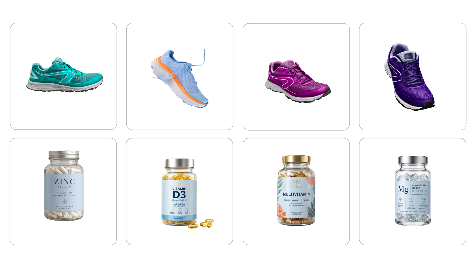
But before we dive into the specific tips, here are three general but absolutely essential pieces of advice:
⭐ First, don’t be afraid to make ugly ads. Seriously. A creative doesn’t need to win a design award, it needs to sell.
⭐ Second, don’t judge a banner by whether it looks nice, but by whether it works. And the only way to find that out is by testing.
⭐ Third, try everything, don’t be afraid to get it wrong, and go ahead and test things you’d swear on first glance could never work.
Now, let’s get into it – eight tips you can try out right away.
🔍 1. Add what people actually care about to the banner
Before you design anything, do a bit of research first. Ask your support team, check the reviews and reasons for returns, and see what people most often ask about your products. That’s exactly the kind of information that belongs on the banner, because it removes the uncertainty that keeps people from buying. And once they do click, it also raises the odds they’ll actually complete the purchase. Since they’re clicking with a clear idea of what they’re getting, they won’t need to second-guess it after the click.
Specific examples
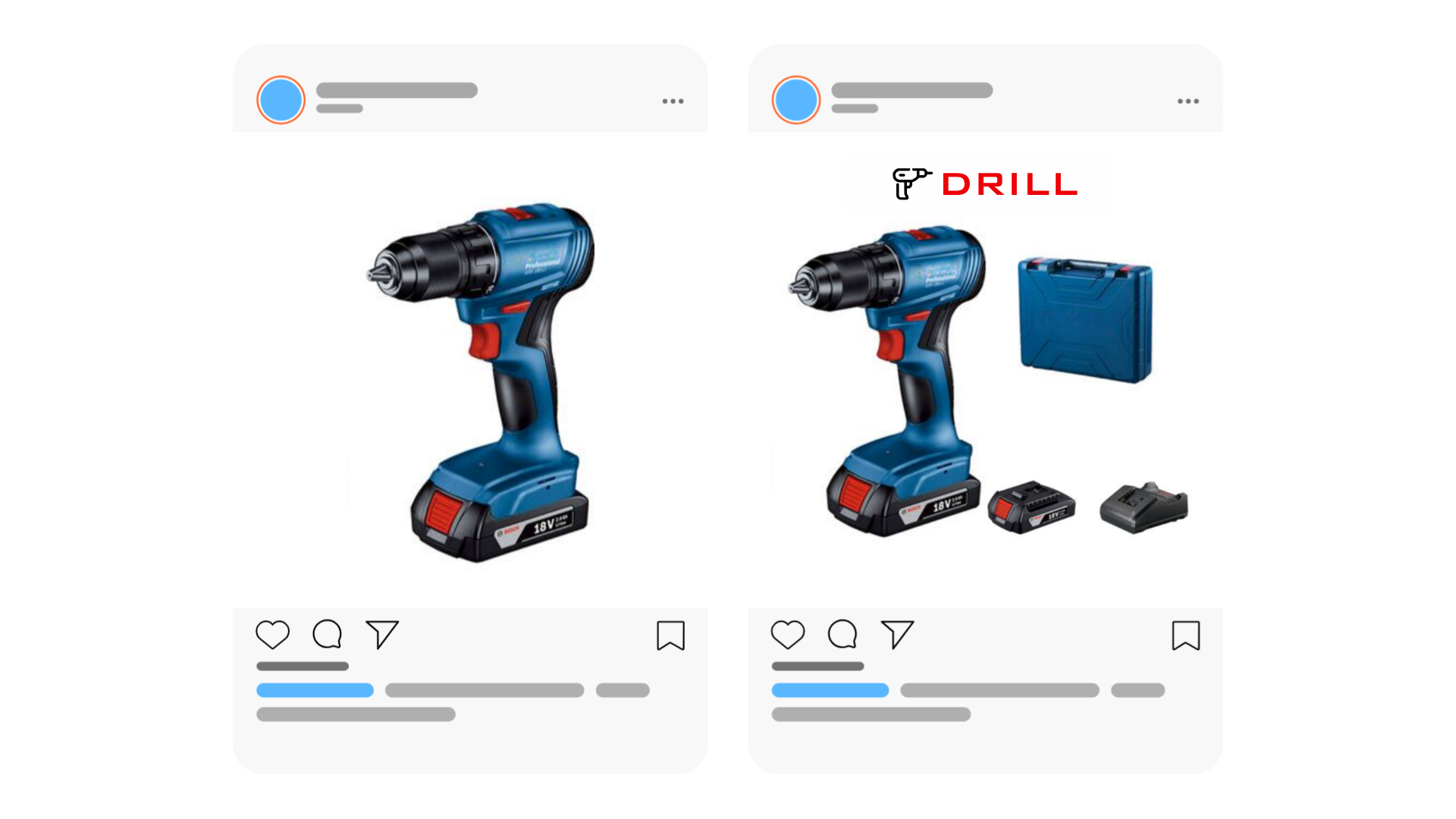
Drill. The classic mistake is showing just the drill itself in the photo, with no accessories. The customer then has no idea what’s actually included, and starts worrying they’ll need to buy a case, battery, or charger separately. And that uncertainty is often enough to stop them from clicking. So show the whole set instead. Make it instantly clear exactly what they’re getting for their money.
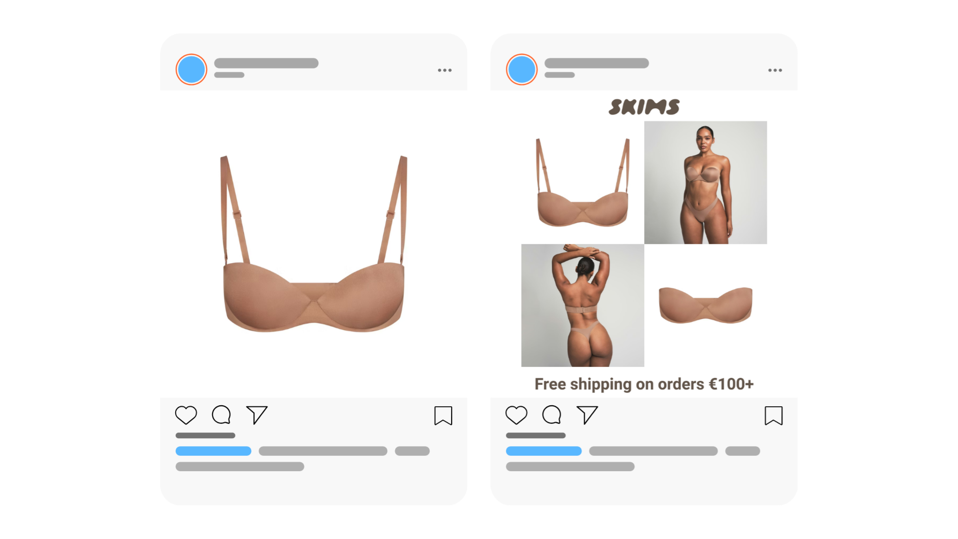
Underwear. If the bra has removable straps, show it. And add a photo on a model, people get a much better sense of how the product will actually look on. Don’t forget to mention free shipping over a certain amount either. Feel free to pack more information onto the banner than might seem right at first glance. Here, sales power beats minimalism.
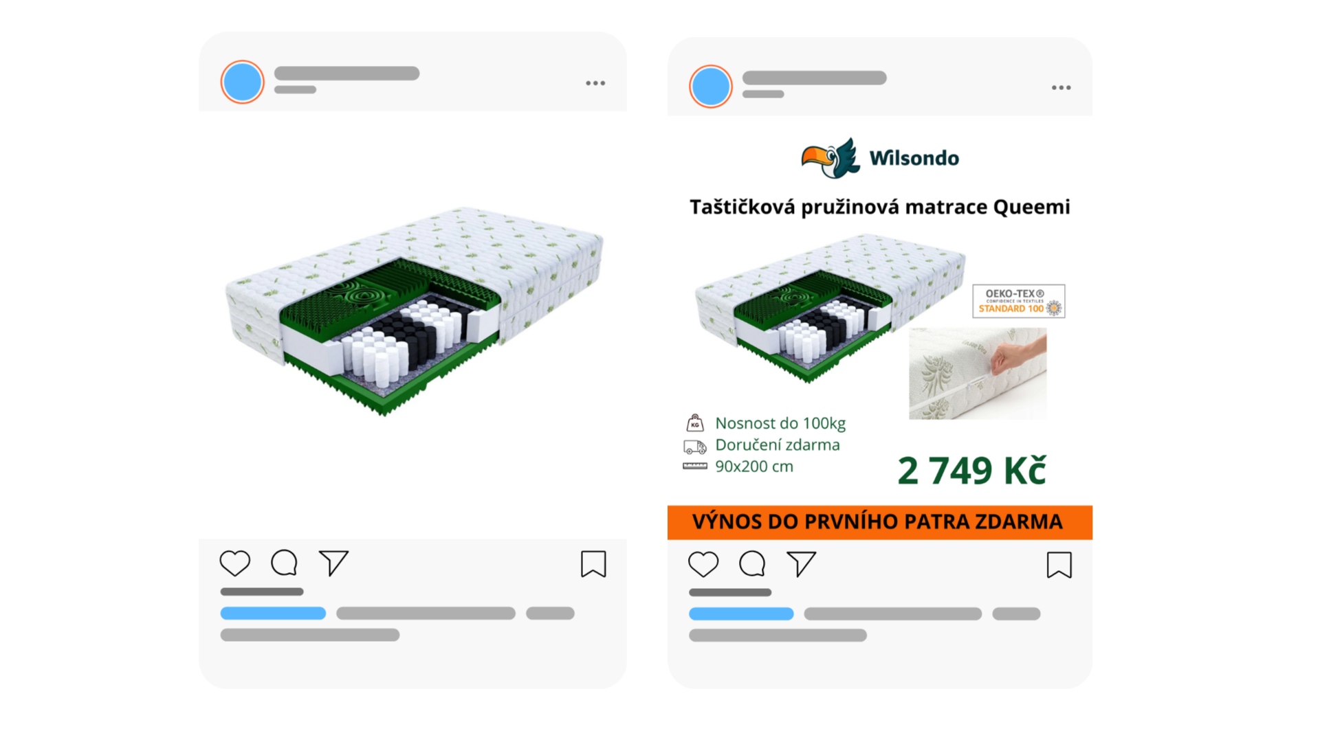
Mattress. You could go with a plain catalog photo on a white background, or show what the mattress actually looks like in context, boosting the odds of converting after the click. Show the dimensions, whether shipping is free, whether the cover is removable and washable. And if you offer free delivery to the first floor, say so. For older or less able customers, that’s a detail that can be the deciding factor in choosing you.
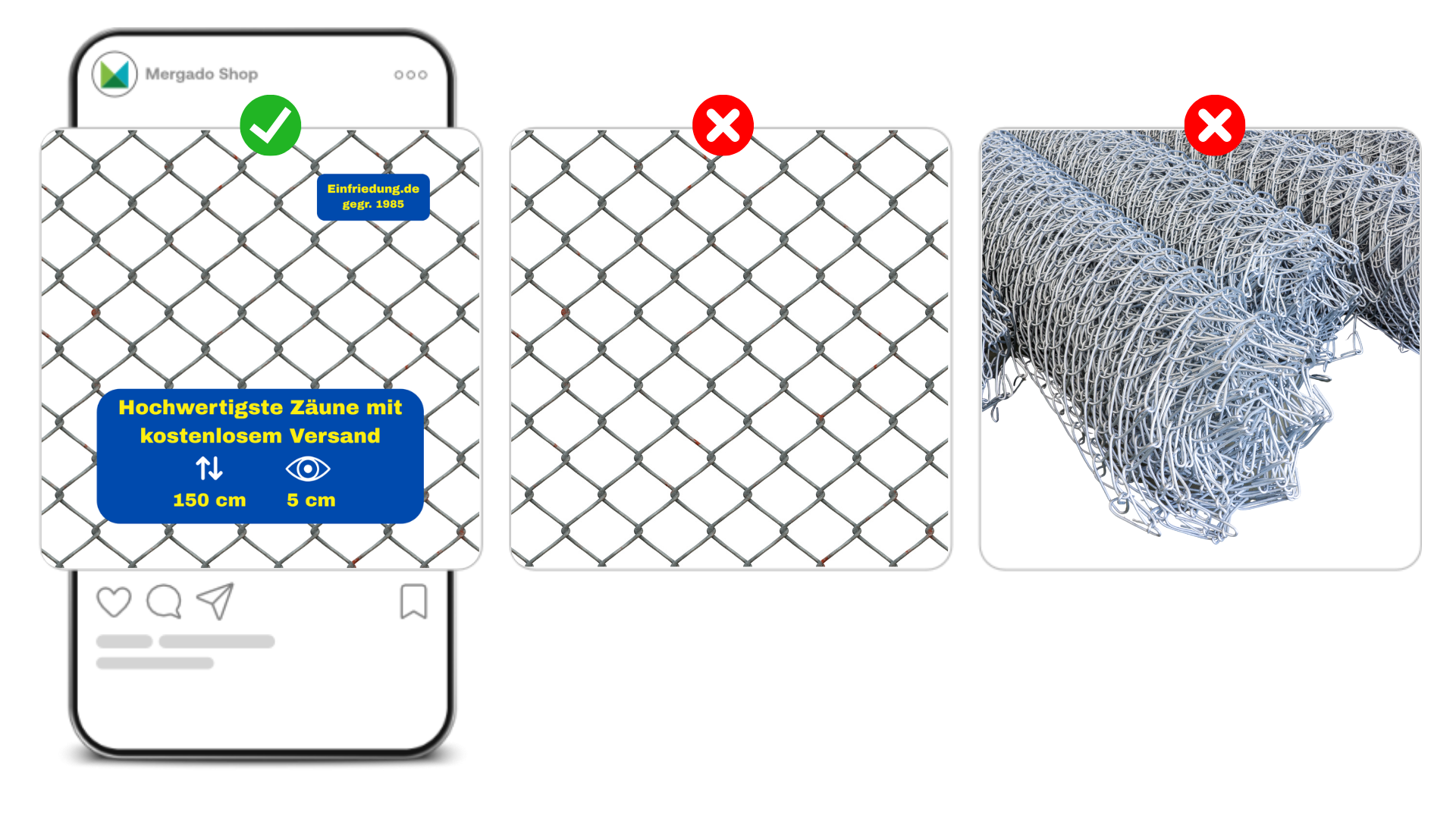
Wire mesh (and other visually unglamorous products). Not every product photographs well. But even with wire mesh, you can show the mesh size, the height, add your brand colors, your font, your logo, and some element that builds trust (like the year your company was founded). Even a visually dull product can look interesting on a banner.
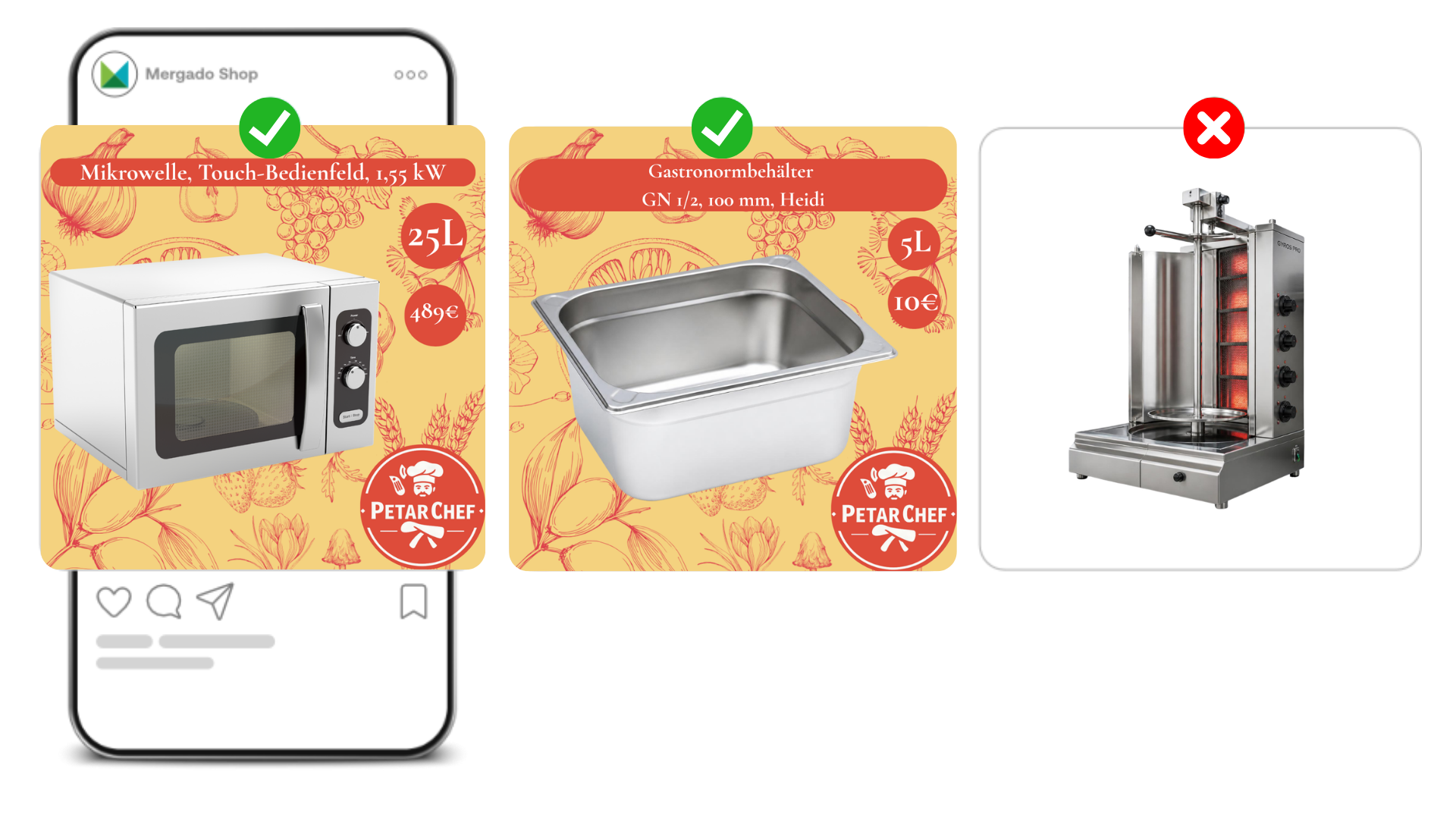
Foodservice equipment. In foodservice, people search by capacity and power. A microwave by size and wattage, gastronorm containers by volume, warmers by how many kilos of meat they can hold. Without these numbers, a banner is useless no matter how nice it looks. Try putting yourself in your customer’s shoes for a moment and think about what you’d actually want to know if you were buying this kind of equipment yourself.
⭐ 2. Let the reviews speak
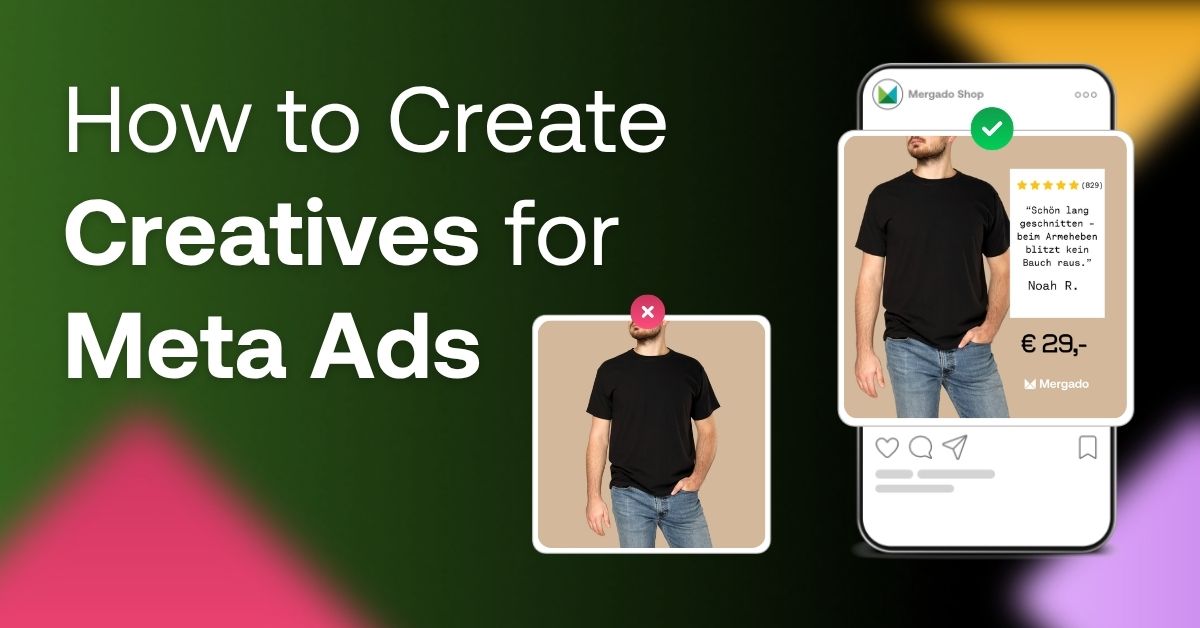
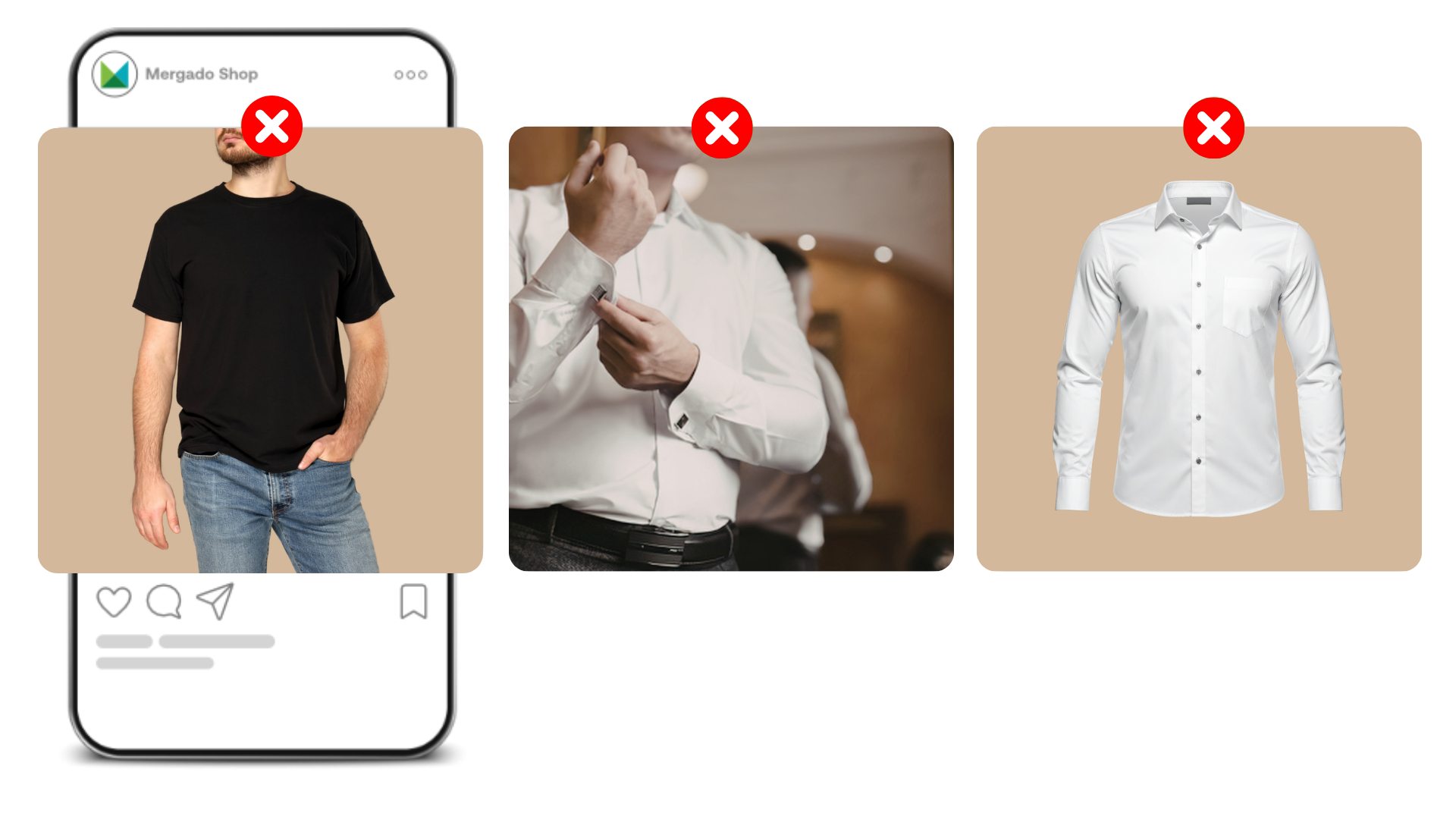
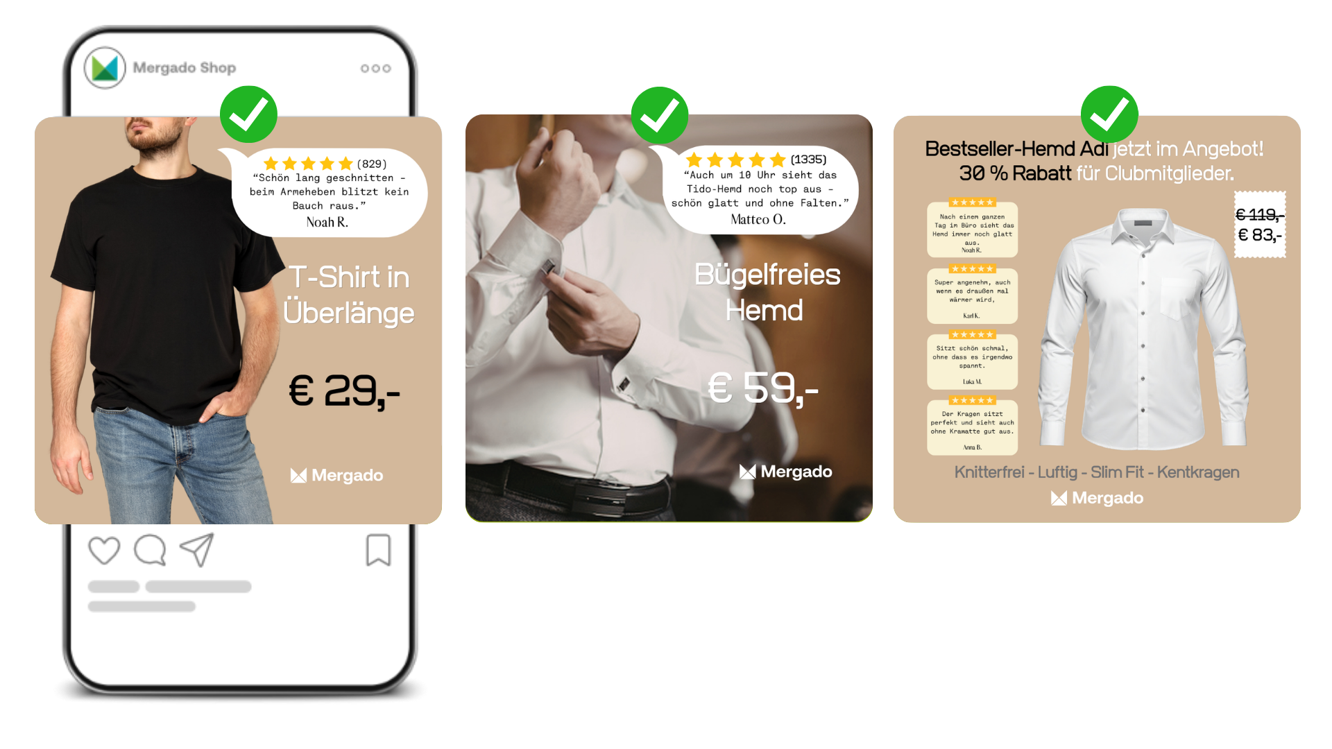
Do you run an online store selling a black t‑shirt, a white shirt, and another white shirt? Then you have exactly what the vast majority of fashion online stores on the market are selling. The only way to stand out is to add something to the banner that your competitors don’t have. And reviews are perfect for that.
Set up your banners so that reviews get pulled in automatically by product ID, framing whatever’s shown in the photo.
Specific examples
Extra-long t‑shirt. A customer’s review says that thanks to the extra length, their stomach doesn’t show when they raise their arms. That’s exactly what a man with a bit extra around the waist, or someone very tall, wants to see. A review confirms it far better than anything else could.
Wrinkle-resistant shirt. A review describes how the shirt still looks smooth and crease-free after a full day at the office. Perfect information for a manager who wears it all day and needs to look sharp in meetings.
Don’t be afraid to put several reviews on one banner at once, each highlighting a different product feature – wrinkle resistance, breathability, slim fit, collar. Four different reasons to buy, all in one place.
📞 3. Put a phone number right on the banner
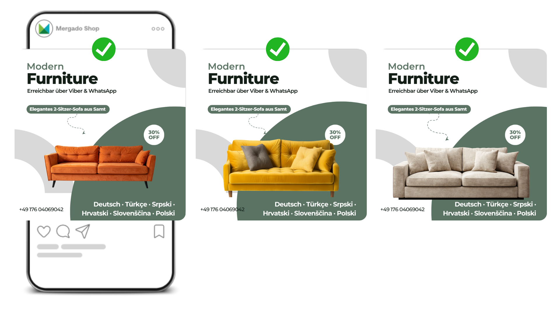
This tip mostly makes sense if customers call you and your call center can close the sale directly over the phone. Typically this applies to pricier items (mattresses, furniture) or unusual products that people like to ask about before buying.
Just add a phone number directly to your catalog banner for Meta Ads. And if call volume ever gets too much to handle? Pull the number off the banner and go back to the original version. Zero risk.
🌍 4. Speak your customers’ language
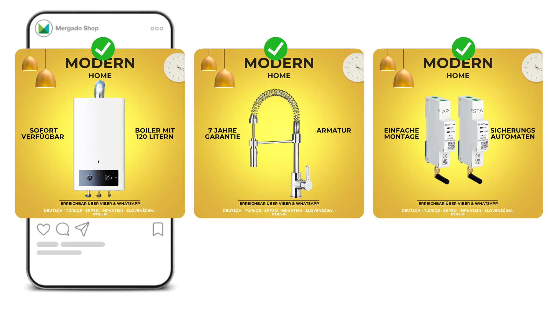
If you sell in multicultural markets, try adding the languages your call center and support team speak to your creatives. In many countries, plenty of people don’t speak the local language well, or simply worry they won’t be able to communicate over the phone. Show them you’ve got that covered, and you lower the barrier to purchase.
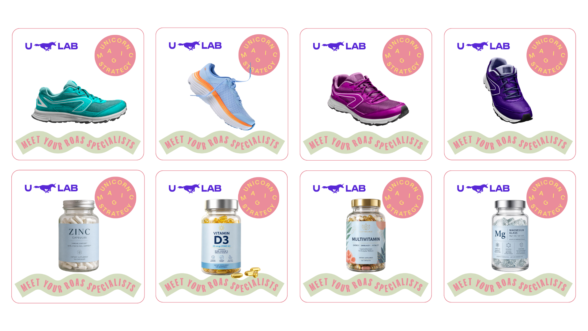
🎨 5. Branding everywhere you can fit it
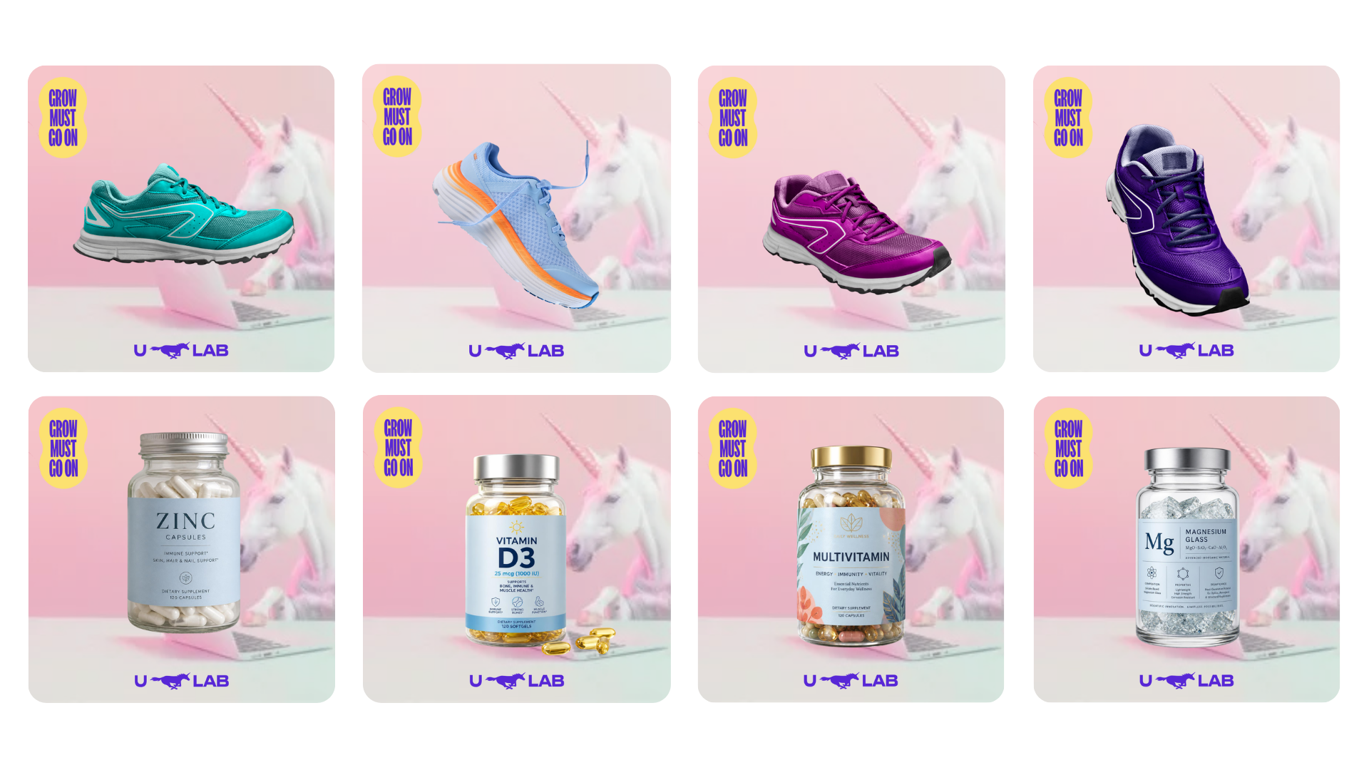
A bare product photo on a white background is always the weaker choice compared to anything carrying your branding. This is doubly true if you’re a multi-brand online store, meaning you don’t sell a private label and you’re not D2C. Without your own branding, you’re just another one of dozens of online stores selling the exact same shoes or the exact same multivitamin. The moment you add your brand elements (or even branded background photography), the product suddenly looks like yours, and people who’ve shopped with you before will recognize you as they scroll.
🕵️ 6. Don’t be afraid to steal: follow trends and get inspired
Czechoslovak president T. G. Masaryk used to say, “Don’t be afraid, and don’t steal.” We say: “don’t be afraid to steal.” Or to put it more precisely – don’t be afraid to take inspiration from competitors and ride whatever trend is currently having a moment. You don’t need to copy anything, just keep an eye on what’s working and adapt it to your own style.
What’s more, the things that work best tend to be surprisingly simple and unremarkable. So a banner like this won’t cost you more than a few minutes.
Examples of current trends
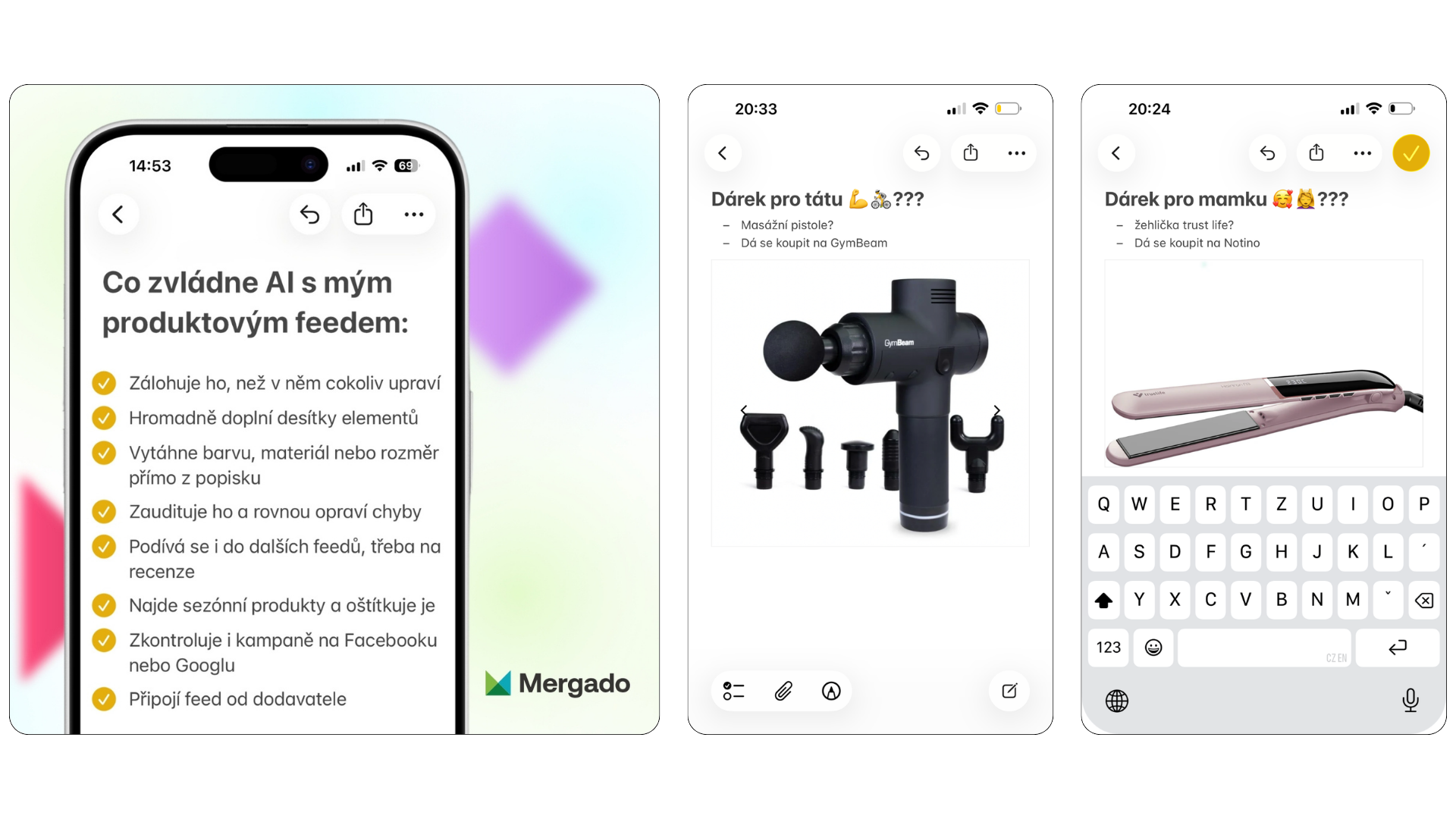
iPhone Notes. Notes app screenshots as an ad format are currently one of the most visible trends across social media, and they work in e‑commerce too. The idea is simple: build a template that looks like a screenshot from the Notes app, then drop in variables like product name, brand, or whatever occasion fits.
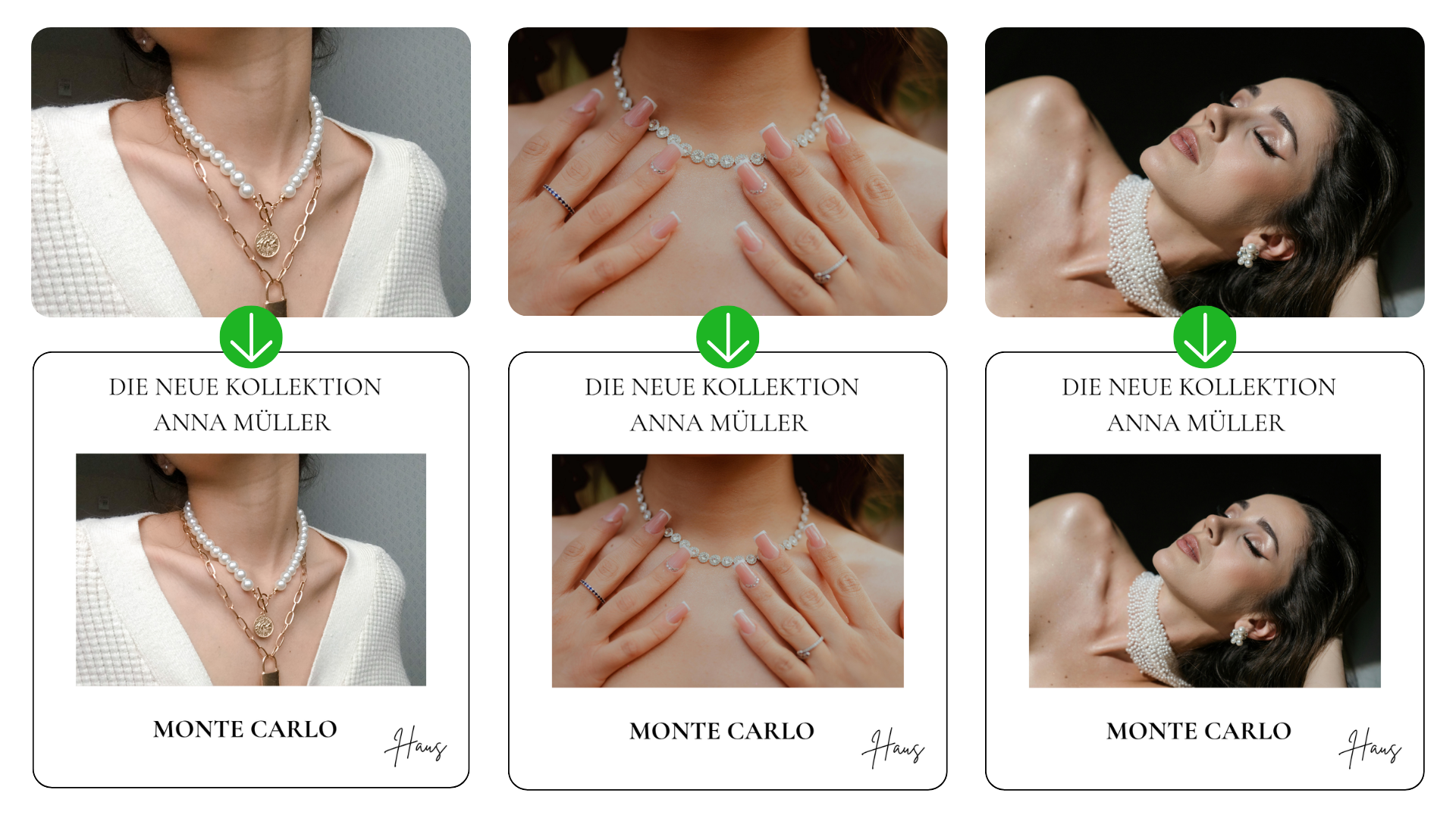
Clean Girl Aesthetic. Another strong trend is the so-called Clean Girl Aesthetic – a clean, minimalist white background that also gives you room for a message. You can use that space for the name of a new collection, the designer’s name, your online store’s logo, or info about free shipping. Banners like this come across as luxurious and uncluttered.
🔒 7. Show that you’re not for everyone
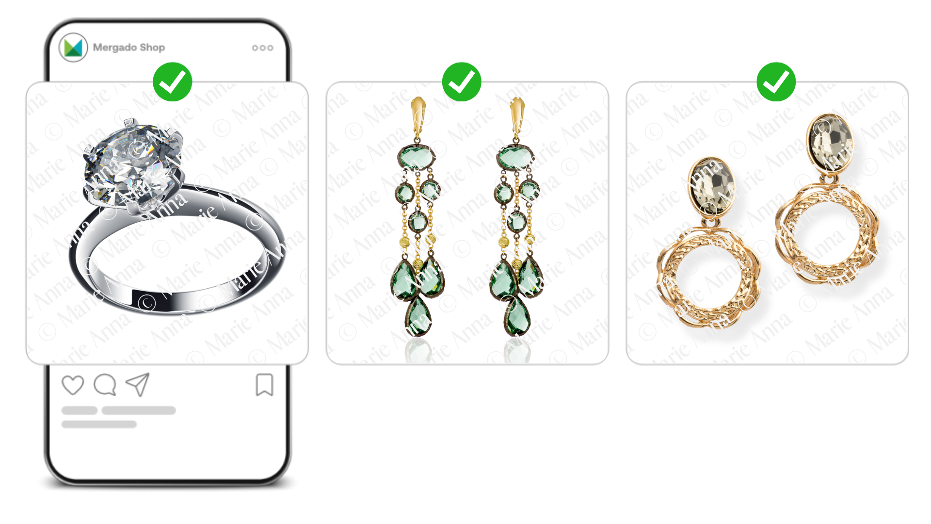
If you run an online store with more upscale products, try adding your own watermark to your creatives. A watermark across the whole product (with your logo or brand name) creates a sense of exclusivity while clearly setting you apart from competitors. It’s a small detail, but it makes an impression. It tells your customers this is something special, not just an item anyone else has in stock too.
⚡ 8. Be ready for flash sales
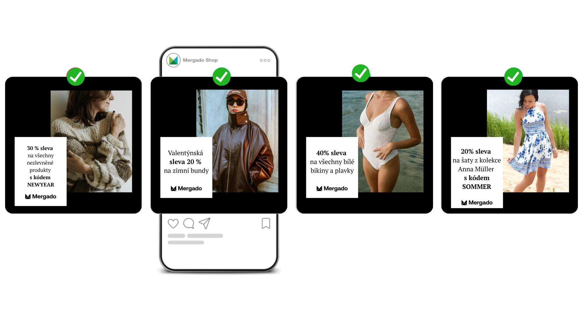
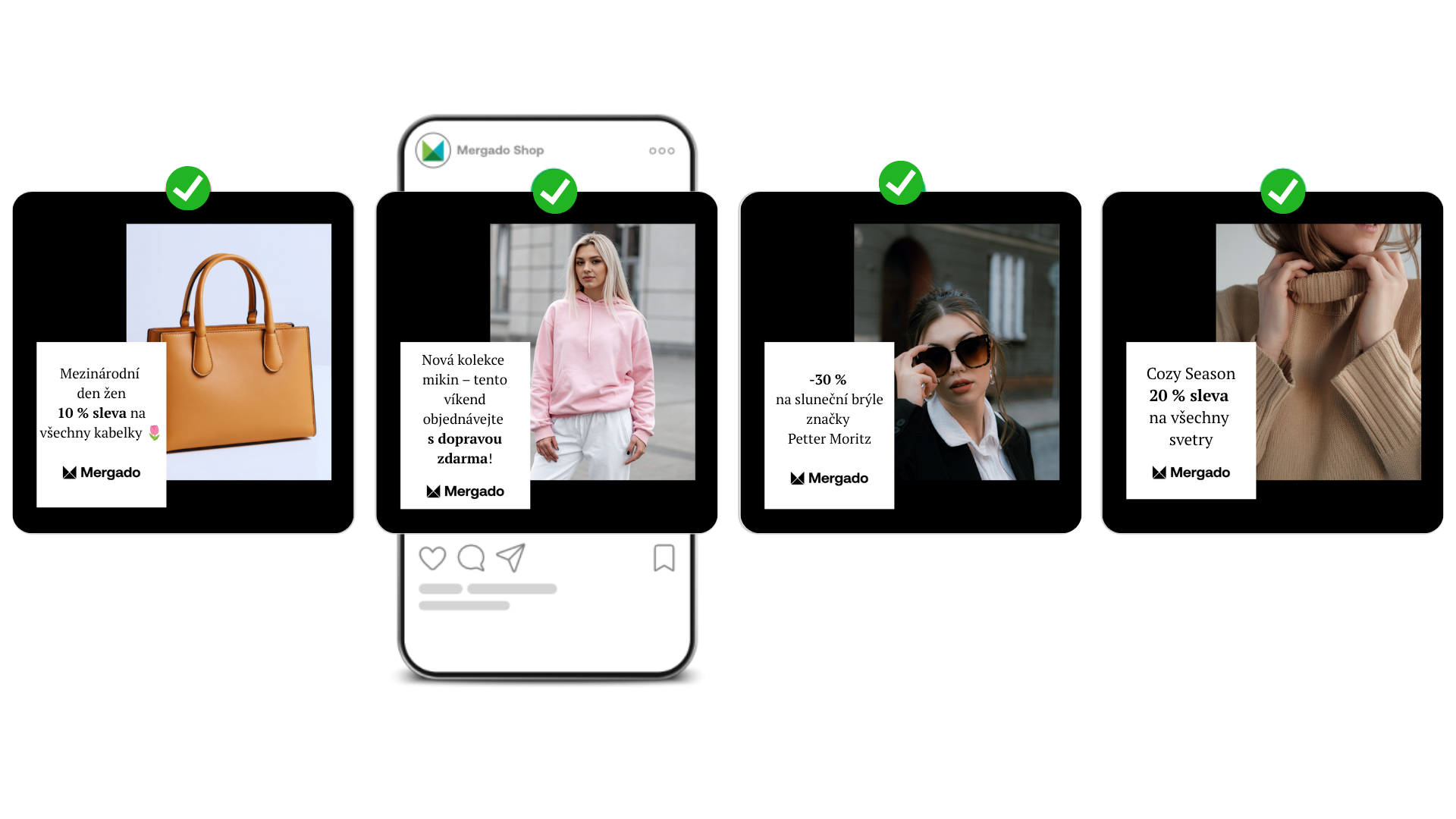
The last tip is about speed. Build creative templates where only the message changes as needed, and plan them out a full year in advance if you want. In the Feed Image Editor, all you need to do is set them to trigger automatically at exactly the right moment:
- a post-holiday sale with a code (e.g., 30% off with code NEWYEAR),
- bulk promotions on seasonal items (a Valentine’s discount on winter coats),
- a promo on a category and color combo at once (a discount on all white swimwear),
- a promo tied to a specific designer with a code (a discount on Anna Müller’s collection with code SOMMER),
and plenty more (International Women’s Day discounts on handbags, a new collection with free shipping for the first weekend, or a seasonal “Cozy Season” promo on sweaters).
The promos update in your templates automatically, you keep a consistent brand look while still reacting quickly to whatever’s happening right now.
Don’t be afraid to test
If there’s one thing to take away from this article, let it be this: don’t judge a creative by whether it looks nice. Judge it by whether it sells. And the only way to know that is by testing different approaches.
Add what people actually care about to the banner, let the reviews speak, show off your branding, try out current trends, and above all, stay ready to react quickly to whatever’s happening in your industry right now.