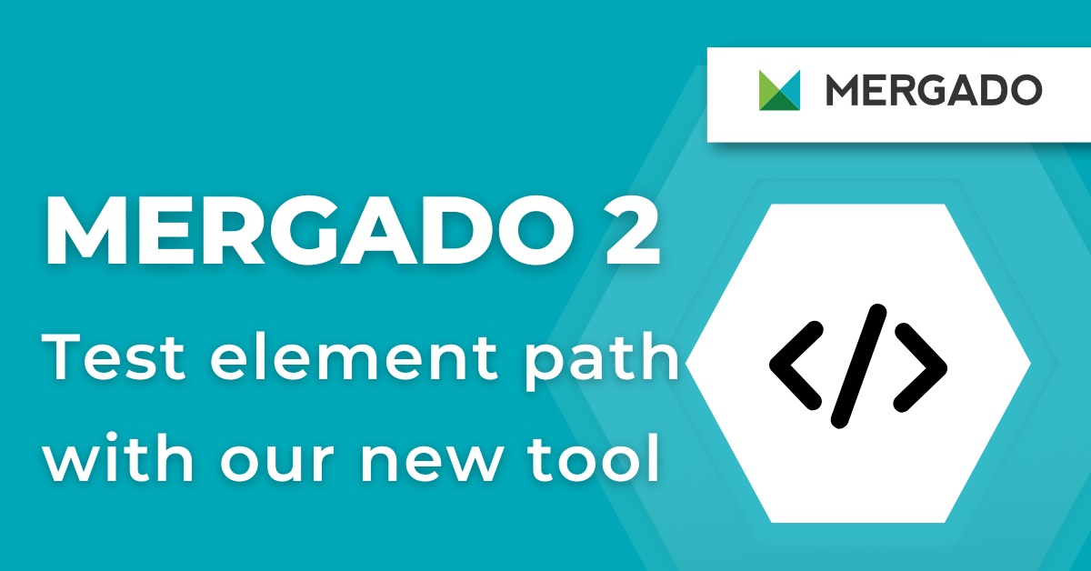


Mergado platform went through a major redesign! We are constantly working on improving not only Mergado functions but also Mergado design so that it’s attractive, easy-to-use and responsive. Let’s have a look at the most important changes in Mergado design and layout.

Mergado platform went through a major redesign! We are constantly working on improving not only Mergado functions but also Mergado design so that it’s attractive, easy-to-use and responsive. Let’s have a look at the most important changes in Mergado design and layout.

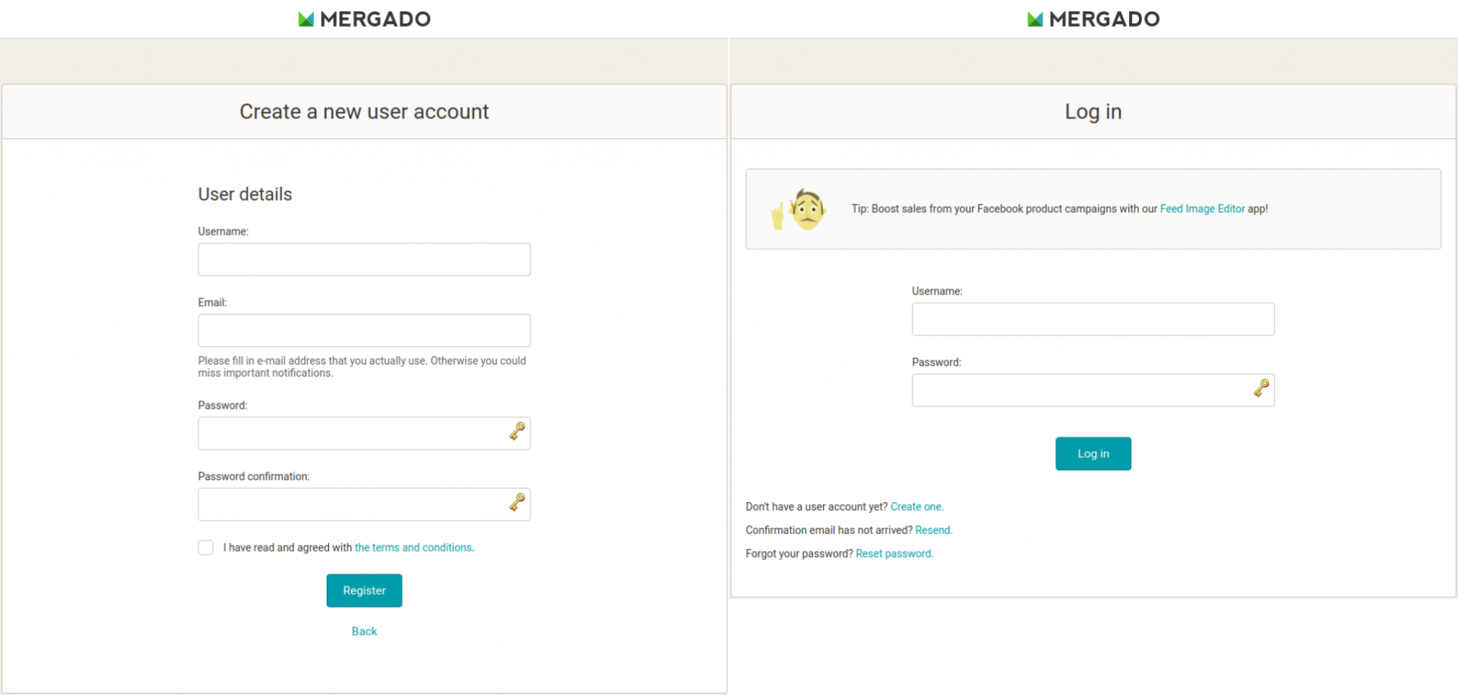
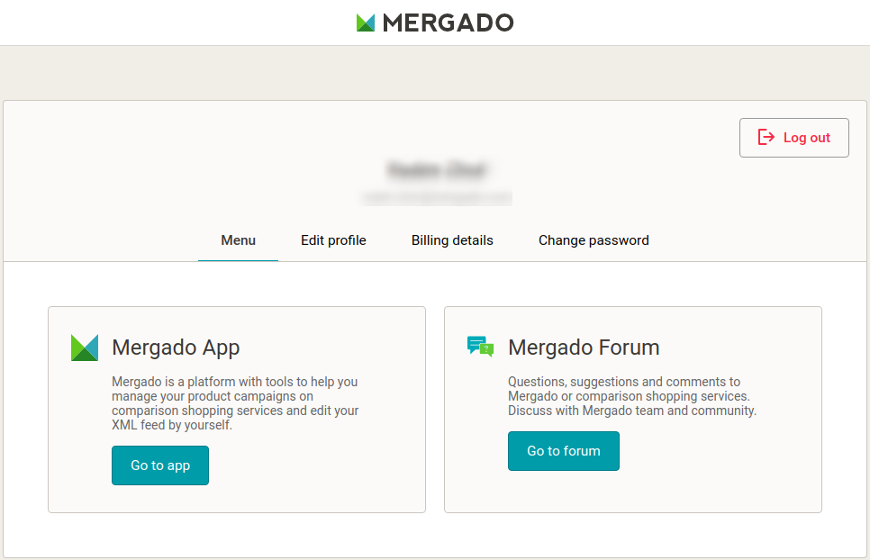
First, there was a major upgrade to Mergado accounts design. When creating a new user account or when logging in to your existing account, you can experience a fresh new look (Image 1 and 2). After you have successfully logged in, you get to your personal account page, where you can edit any of the account settings such as personal details, billing details or password. When finished, you can navigate either directly to Mergado app or to Mergado Forum.
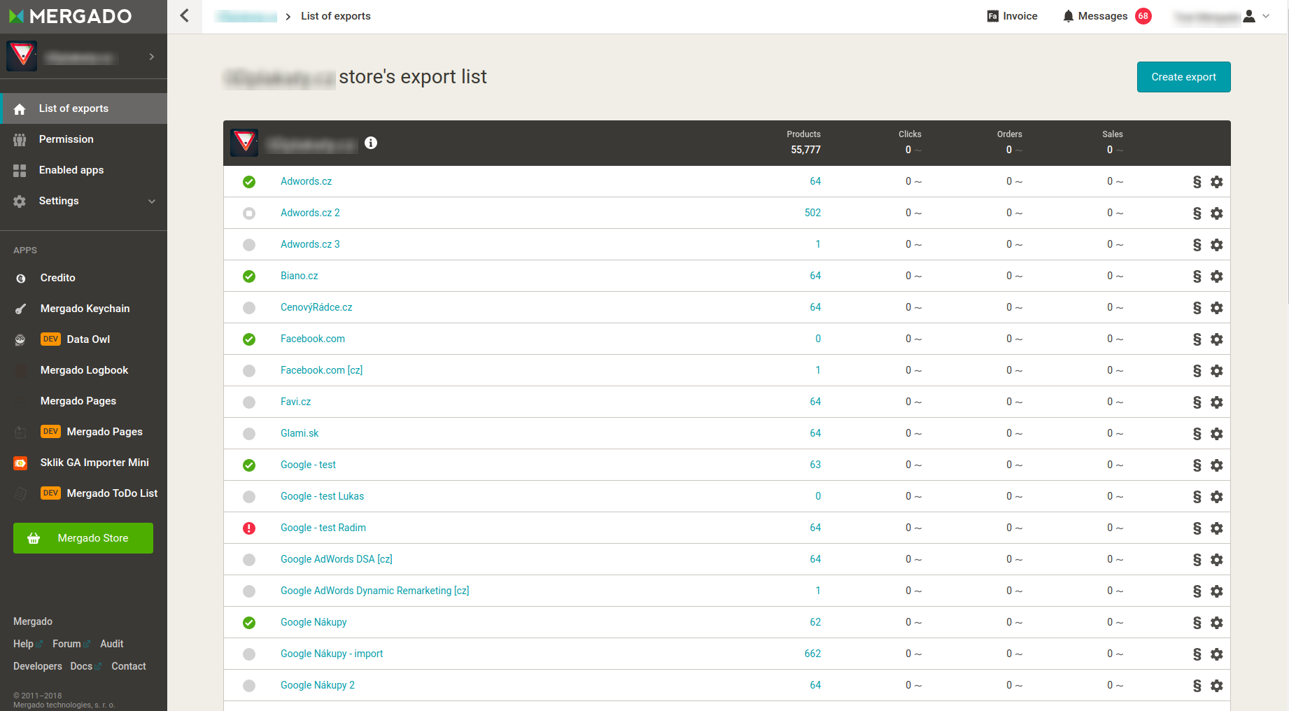
Perhaps the biggest change of the whole redesign is the shift of our MENU from the top to the left side. This will allow you to navigate and work faster than before (Image 3).
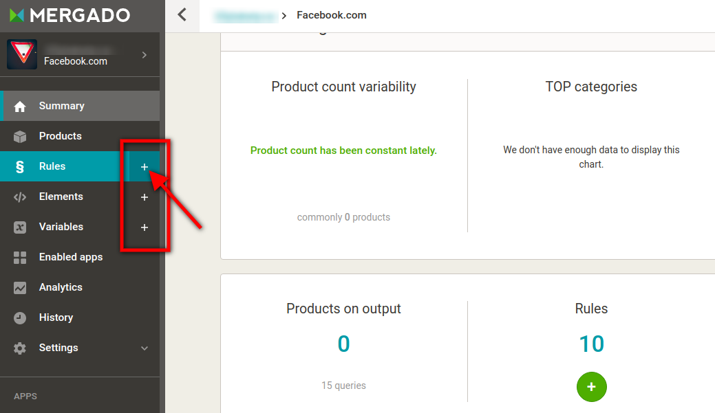
There is no change in functionality except from a new feature. Now you are able to create a new rule/element/variable directly from the Menu by clicking the plus sign (+) (Image 4).
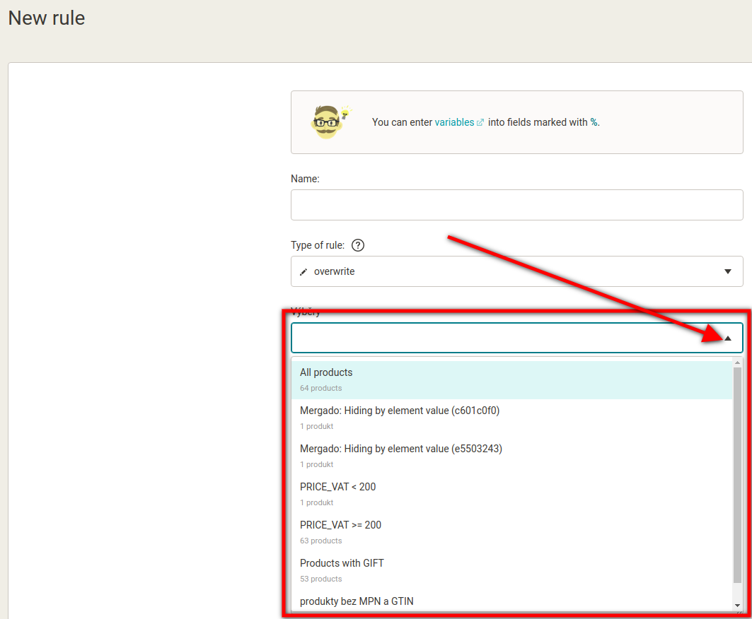
Creating a new rule itself also received an update. To choose a query to which a new rule will be applied, you no longer navigate to a list of queries on the right, but simply select from a list of queries in the middle of the page (Image 5). You can still select one or multiple queries, as well as deselect any of them.
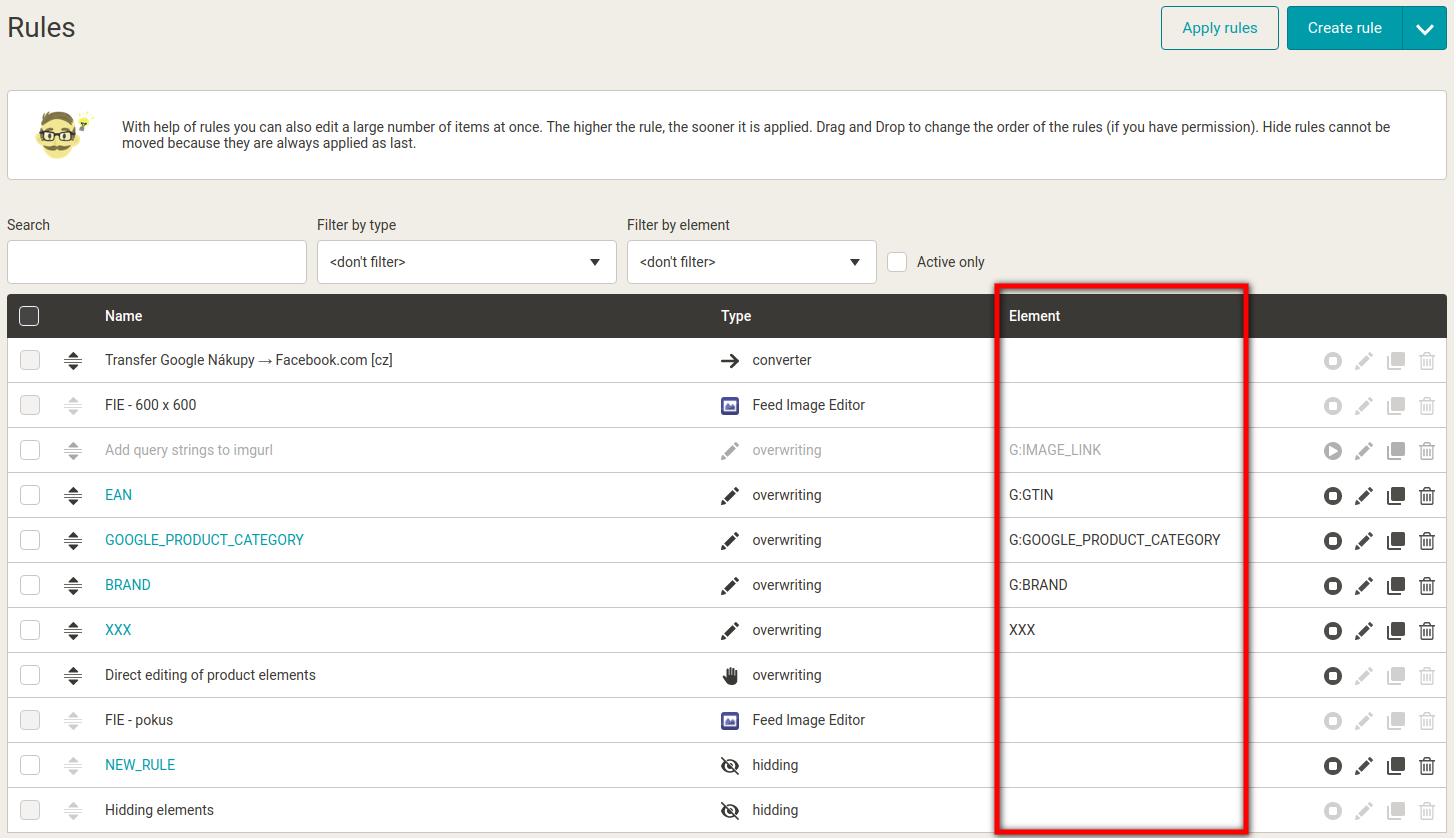
A new column was added to the list of rules on the Rules page (Image 6). In the new Element column, you can now see which element is affected by the respective rule.
We hope you will like the new Mergado design. If you have any notes or remarks, don’t hesitate to let us know! We are happy to hear your feedback.

Radim Zhoř
- He has several years of experience in e‑commerce.
- He works as a Business Development Specialist at Mergado, where he helps to market the Mergado product management tool.